PROJECT OVERVIEW
Compare assets, then open the relevant action.
MultichainZ brings token lending and liquid staking into one product. My work covered graphic design and UI/UX. The interfaces shown here move from comparing lending markets to entering an ETH staking amount and reviewing withdrawal states.
To me, the blue-to-violet mark and navy panels give the brand a technical feel. Green draws attention to wallet connection and rates, while the staking panel uses violet for its central action. Those accents give the dense dashboard a recognisable connection to the linked brand mark.
01 / MARKETS & WALLET STATE
Separate market information from account information.
The market keeps asset names, balances and rates in one table, with Supply and Borrow on the same row. The staking dashboard centres the wallet requirement inside the empty positions panel. These public captures show the product’s current service notice and disconnected state.
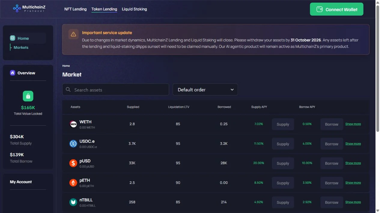
The market aligns supplied amounts, borrowing and rates across each asset row, with Supply and Borrow beside the corresponding figures. That arrangement connects comparison with the asset-specific action. Search and ordering sit above the table; wallet connection stays in the header. The amber service notice is a current product message above the market.
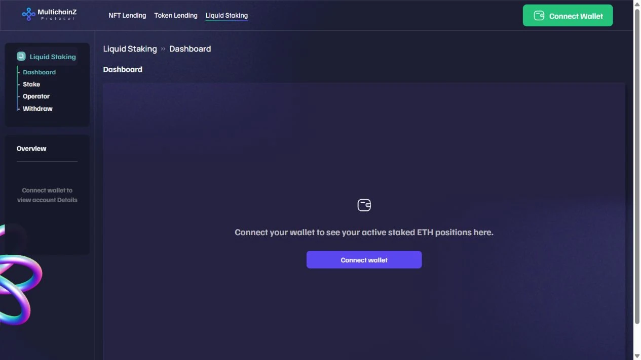
The disconnected dashboard replaces account positions with a wallet icon, a short explanation and Connect wallet. Placing that action inside the empty panel explains the missing data at the point where positions would appear. Dashboard, Stake, Operator and Withdraw remain in the left navigation, preserving the section structure before connection.
Public app · October 2026. Figures, service notices and account states are part of these captures.
02 / STAKING FORM
Keep the ETH input and xETH output together.
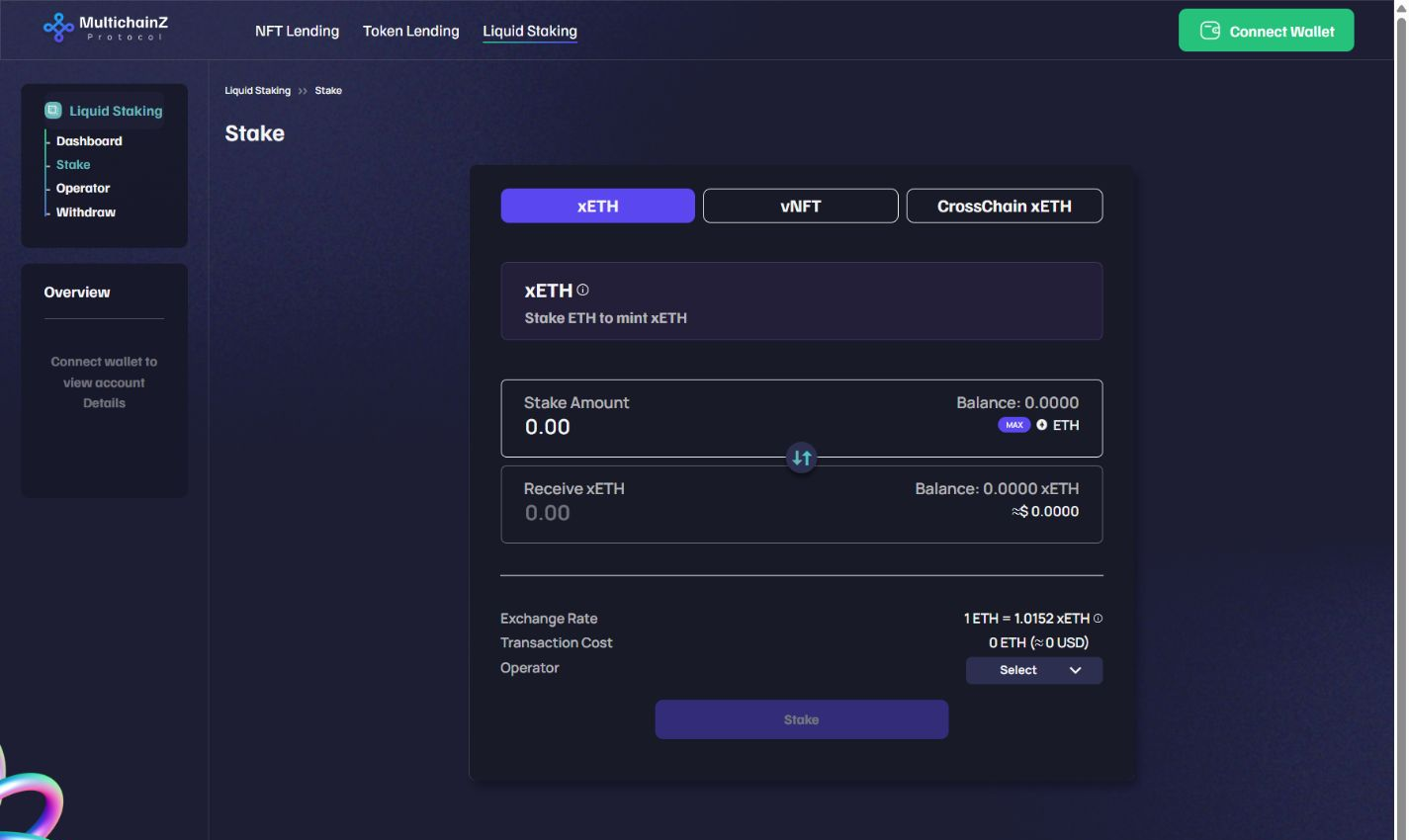
The ETH amount sits directly above the xETH output, with the direction marked between the two boxes. Balance, MAX and the asset name stay beside the input. I kept the exchange rate, transaction cost and operator choice below the amount fields, so those details can be checked before reaching Stake. The violet xETH tab identifies the selected staking mode; this disconnected view leaves the final action inactive.
Public staking form · Wallet disconnected · October 2026.
03 / WITHDRAWALS
Separate the available balance from pending requests.
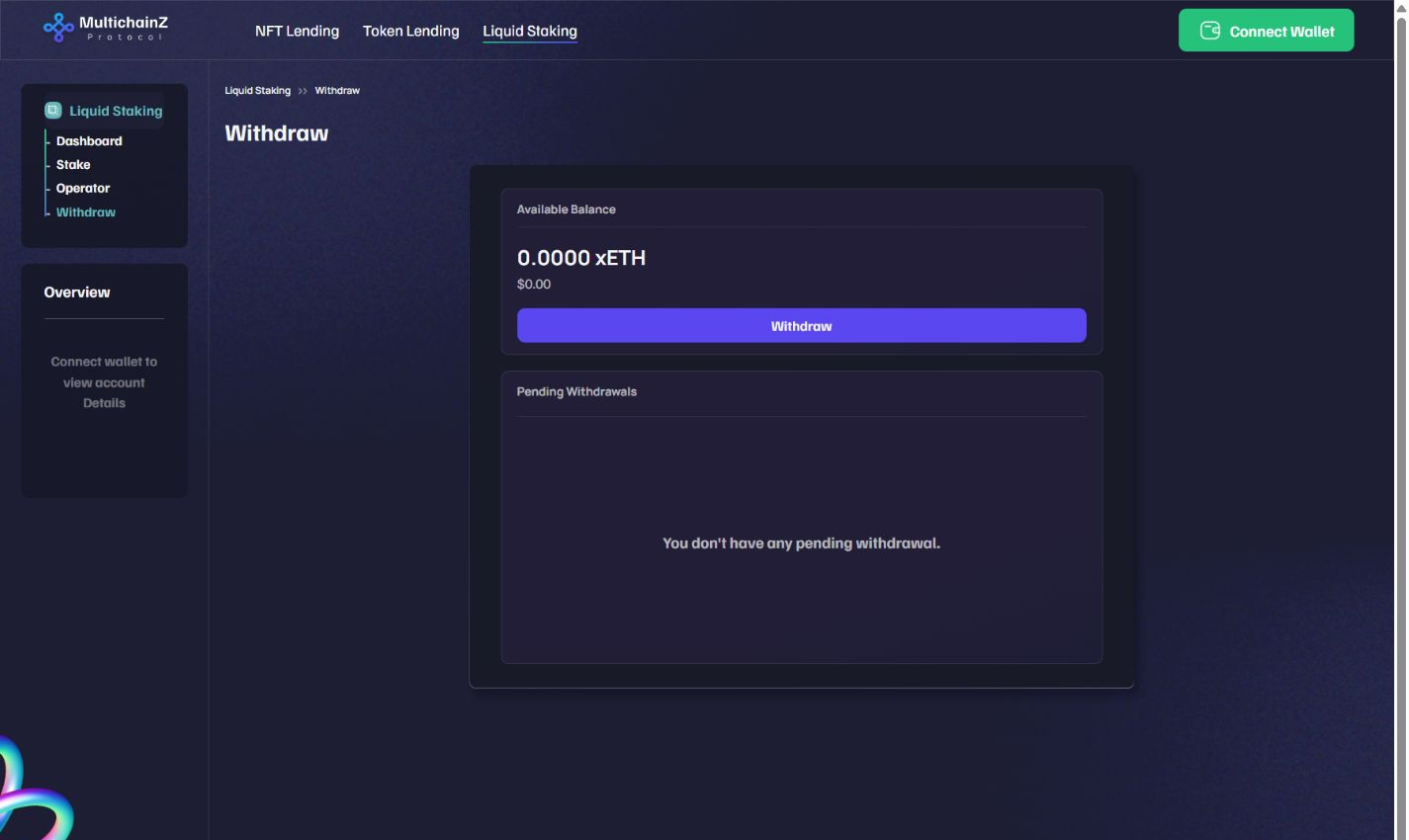
I separated the available xETH balance from the pending-withdrawal panel. The balance and Withdraw action stay together at the top; requests have their own area below. The empty message sits inside that panel, making it clear that no request is waiting rather than leaving an unexplained blank space. The left navigation keeps Withdraw highlighted within the same staking section.
Public withdrawal view · Wallet disconnected · October 2026.
04 / VISUAL ASSETS
Explain the product through icons and short statements.
These published project graphics show the violet accent outside the application: a three-part feature sheet and a horizontal set of token-use icons.
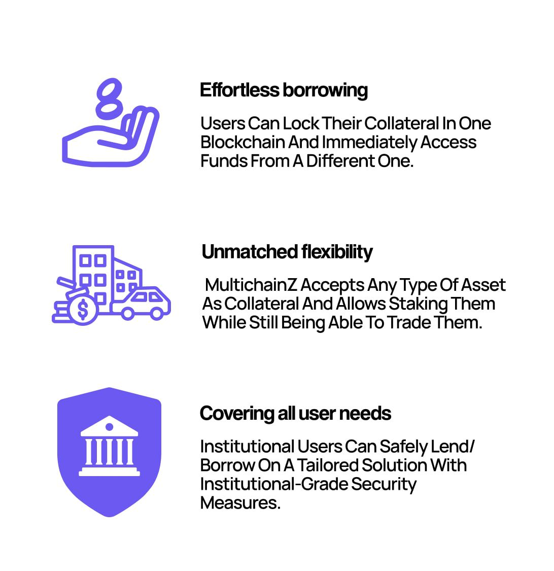
Three stacked rows give each feature its own violet illustration, bold heading and explanation. The hand introduces borrowing, the grouped objects represent collateral types, and the shield and building identify the institutional section. Keeping the illustrations in one left-hand column gives the text a consistent starting edge.

The four uses sit on a single horizontal row. A ballot box, circular exchange, rising chart and gift distinguish voting, trading, rewards and grants. Each icon uses the same violet and sits above a short black label, keeping the categories separate without adding four surrounding cards.
Original published MultichainZ project artwork · Republic campaign.
05 / PRODUCT WALKTHROUGH
See the dApp in motion.
The original product introduction, published on the MultichainZ channel.
EXPLORE FURTHER