PROJECT OVERVIEW
The idea behind True Colors.
The founder’s premise was that people often reveal their less flattering traits later in a relationship. True Colors brings that disclosure into sign-up: people identify their own negative traits, which become part of how they present themselves. The app also includes messaging, travel preferences and date planning.
01 / THE BRIEF
Build a dating app with its own identity.
I started with the founder’s concept and no existing designs. The brief gave me creative freedom, with one clear requirement: distinguish the product from Tinder while keeping it recognisable as a dating app. I owned the wireframes, screen flows and interface design, working directly with the CEO through repeated rounds of feedback.
The difficult part was presenting a controversial premise alongside a large set of features and personal filters. My decisions centred on how much information to show, where actions belonged and how to make a busy product easier to take in.
02 / LOGO
I designed the logo too.
Alongside the app, I designed the True Colors logo. It sits in the app’s header, so you can see it across the screens in this case study.

03 / PROFILE SETUP
A profile first. Location next.
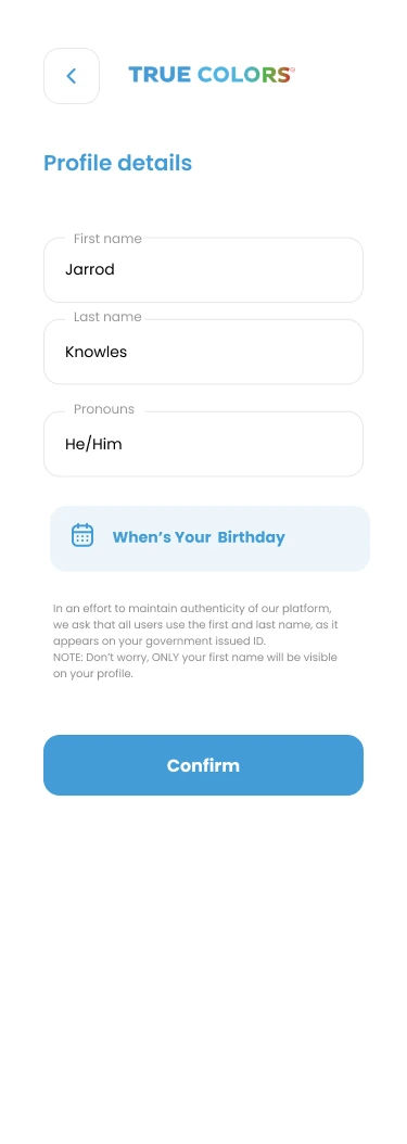
Asking for a full name needs an explanation. I placed the note before Confirm so it explains both why the app requests those details and that only the first name will appear publicly. That information belongs with the fields, before they are submitted.
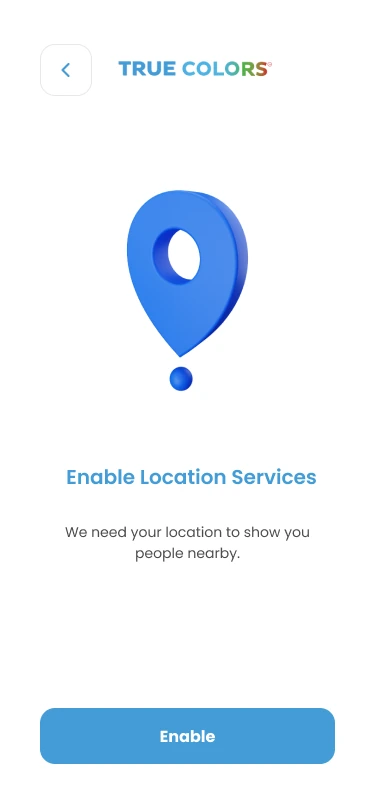
Location is a separate request with a specific purpose: showing nearby people. Giving it its own screen lets the explanation sit directly above Enable, rather than folding device permission into the profile form.
04 / TRAIT SELECTION
Choosing your true colours.
 Long screen · expand image ⤢
This is where the premise becomes a choice people make about themselves. Each tag pairs a trait name with a colour, keeping the meaning explicit. The instructions ask for at least three, explain how to see definitions and make clear that selections can be updated later. The long list also shows the density I now need to simplify.
05 / DISCOVERY & MATCHING
From a profile to a match.
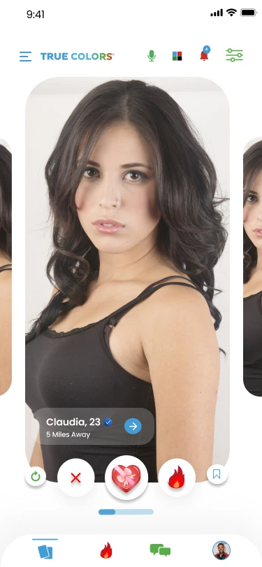
React or take a closer look.
I kept the photo, basic details and reactions together so someone can respond without opening the full profile. The arrow provides a separate route into more detail. That distinction matters here: reacting to someone and learning more about them are different actions.
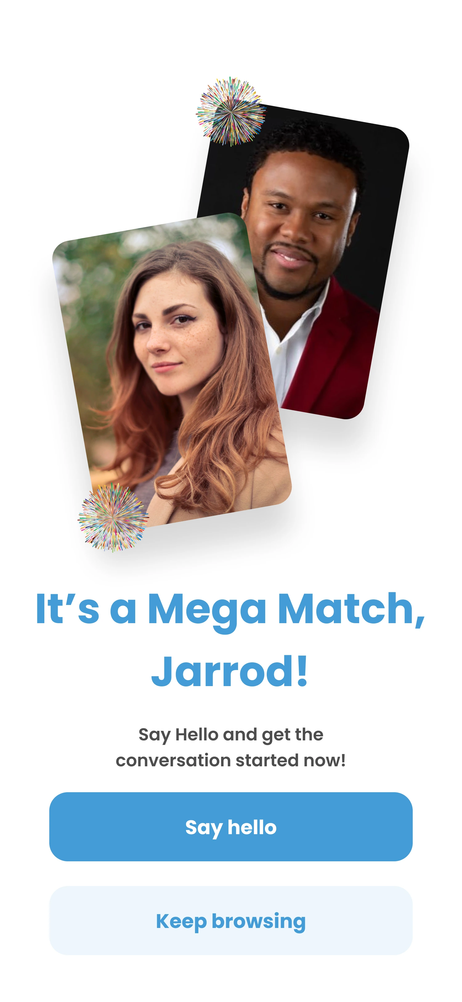
Make starting a conversation the next step.
The overlapping portraits make the connection the focus. I gave Say hello the strongest emphasis to carry that moment into a conversation. Keep browsing remains available beneath it, so a match does not force an immediate message.
06 / MESSAGES
See who’s interested. Start talking.
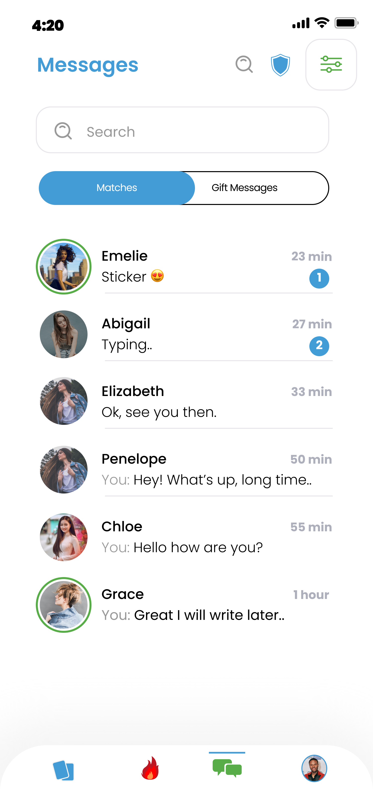
The preview answers what the last exchange was; the unread count shows which conversations have new activity. I kept both visible in the list so choosing a thread does not require opening each one. Gift Messages has a separate tab to keep that collection accessible.
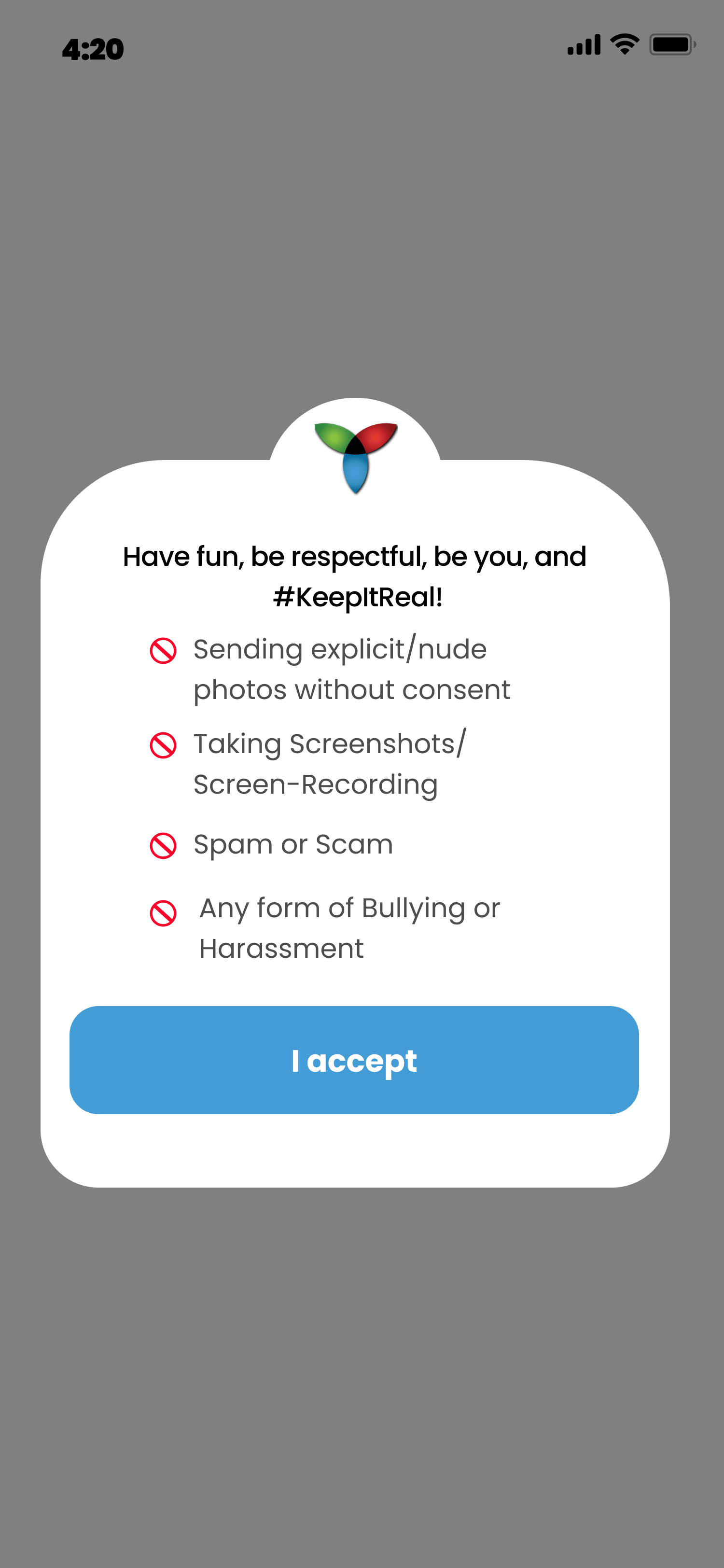
I brought the messaging rules into a single dialog with one acknowledgement action. The short list names the boundaries around consent, screenshots and recordings, spam and harassment. The dimmed background gives those rules focus, while the large I accept button makes acknowledging them the main action on this screen.
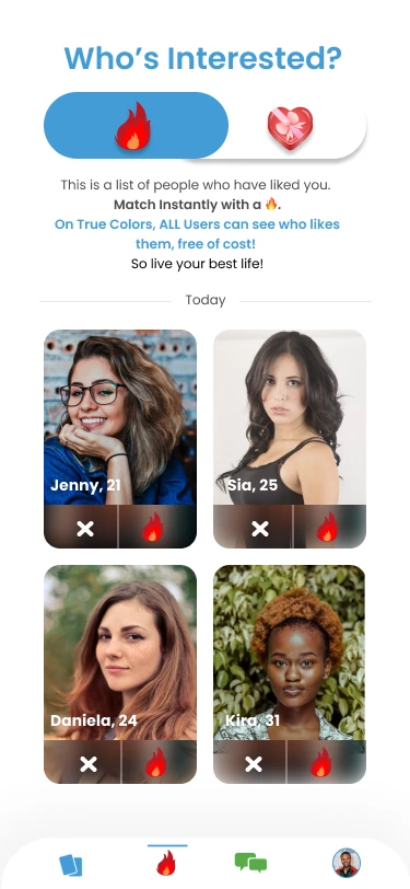
Each card pairs the person with the decision: dismiss or respond. Keeping those controls attached to the photo makes it clear who the action applies to. The selector above the cards switches between reaction types without changing that structure.
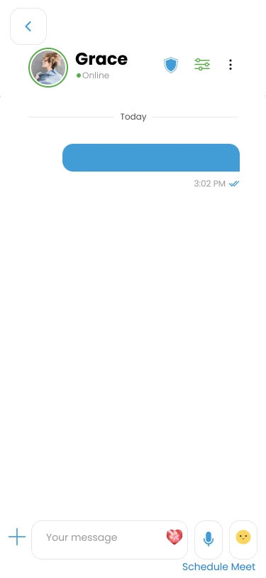
I put Schedule Meet beside the message controls because planning a date follows naturally from the conversation. It has its own entry point, while the message field remains focused on the exchange. The portrait and Online status keep the person visible above it.
07 / DATE PLANNING
Take the conversation into date planning.
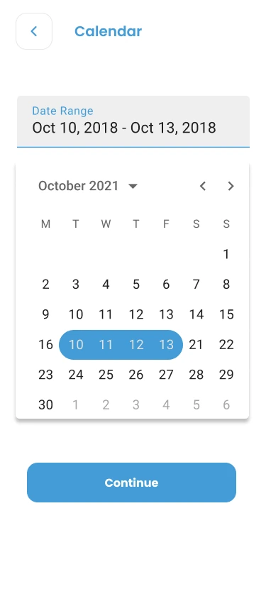
This screen asks for a date range, so I used one continuous highlight across the selected days. The summary above the calendar gives the range its own place, with Continue below as a separate confirmation step.
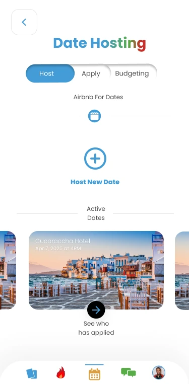
Creating a date and managing an existing one need different entry points. Host New Date sits above the active plans; See who has applied belongs to each individual date. The venue image, name and date provide the context for reviewing its applicants.
08 / PROFILE & FILTERS
Bring the traits into the profile and preferences.
 Long screen · expand image ⤢
The trait tags sit near the name and photo because they are part of how the app introduces someone. Travel, lifestyle and interests follow in separate sections. That gives the core premise a visible place in the profile while keeping the rest of the information grouped by topic.
 Long screen · expand image ⤢
The two trait questions distinguish what someone wants to avoid from what they are looking for. I kept the remaining preferences in a repeated question-and-field layout. This screen also shows the trade-off behind the feedback we received: the structure is consistent, but the number of choices makes it dense.
09 / LAUNCH & NEXT STEPS
The next challenge is simplifying the experience.
True Colors is launched and has around 5,000 users as of October 2026. I continue to work on the app. The current version includes some newer screens, while retaining much of the design shown here.
The feedback we have received is that people like the design but feel overwhelmed by how much there is to do. That is the clearest lesson from the project so far: the app needs less to take in at once. My next focus is simplifying how its features are presented and making the experience easier to navigate. That is my next design priority.
EXPLORE FURTHER