PROJECT OVERVIEW
On-demand programmes and a live channel.
Dining Empire streams food, travel and lifestyle programmes. I designed and built the app and website. The screens show two viewing routes: choosing an individual programme and joining the live channel, with subscription access identified alongside the content.
01 / EARLY WIREFRAMES
The first welcome, Home and promotion screens.
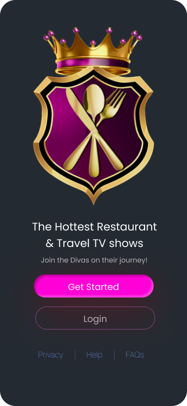
Welcome and entry
I gave the crest the upper half, then placed Get Started and Login beneath the programme headline. Magenta fill makes the new-account action stronger than the outlined Login. The support links sit below both.
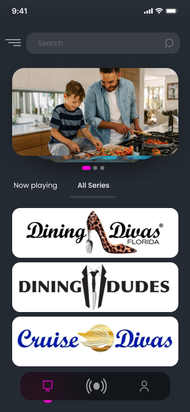
Series-led Home
I used large series logos as the browsing choices beneath the carousel. Search sits above the content; the three-icon bar stays below it. This version introduces the series brands before individual programmes.
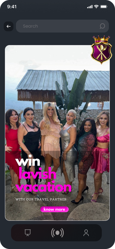
Travel promotion
I gave the promotion one large image, with the crest overlapping its upper edge. The magenta campaign headline and Know more button sit within the image, keeping the promotion and its response together.
02 / DESIGN DEVELOPMENT
Bring the programme forward.
The early Home focused on series logos. In the finished design, I brought individual programmes forward, placing the title, runtime and subscription requirement together. That changes the first decision from choosing a series brand to considering a specific programme. I also replaced the three-icon navigation with four named destinations.
03 / HOME
Show the programme and its access requirement together.
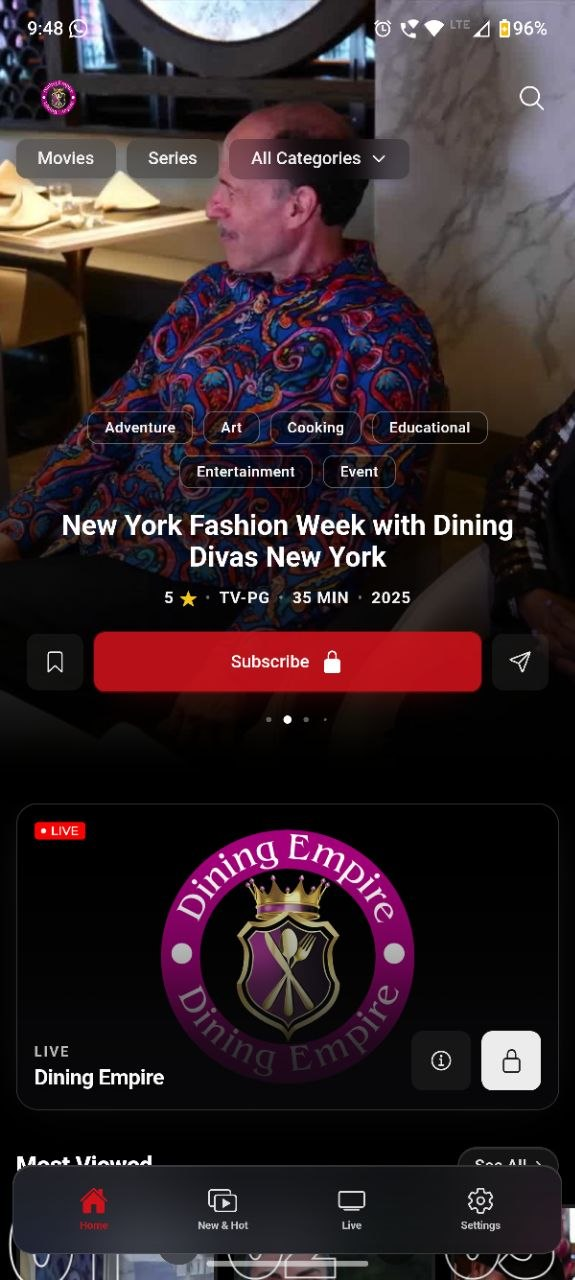
The feature and live-channel card.
I kept the programme title, rating, runtime and year immediately above Subscribe. The red button includes a lock, so the primary action states the access requirement before playback. Bookmark and share remain smaller controls beside it. The live card below separates two pieces of information: LIVE identifies the broadcast format; the lock identifies access. Movies, Series, categories and search stay above the feature, keeping the wider catalogue available.
04 / HOME COLLECTIONS
Give each collection a recognisable entry.
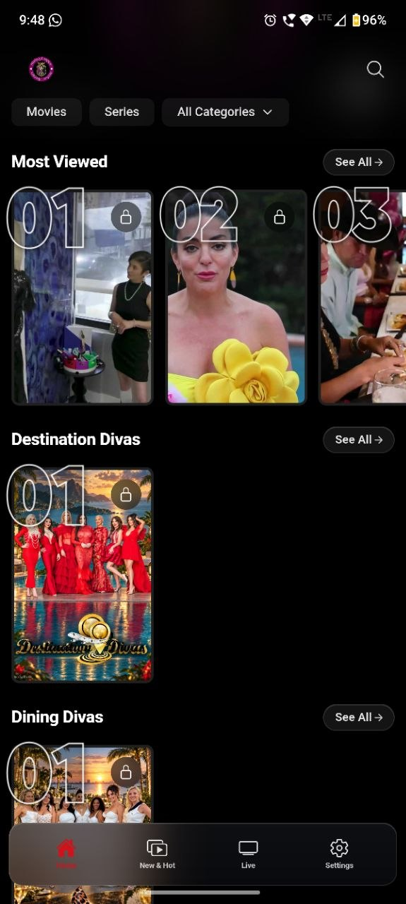
Ranked programmes and series
I used numbered portrait cards for Most Viewed, then separate headings for Destination Divas and Dining Divas. See All stays beside each heading, giving the collection its own route beyond the row. Locks remain attached to individual programmes.
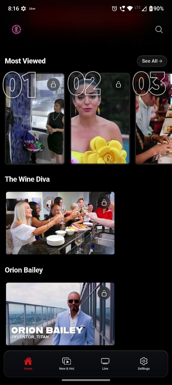
Portrait and landscape collections
The Wine Diva and Orion Bailey use wider images below the portrait ranking. I changed the artwork proportions to give these collections a different visual rhythm while retaining the title-above-image structure. The Home navigation remains visible beneath the catalogue.
05 / CATALOGUE BROWSING
Choose between a programme introduction and a compact collection.
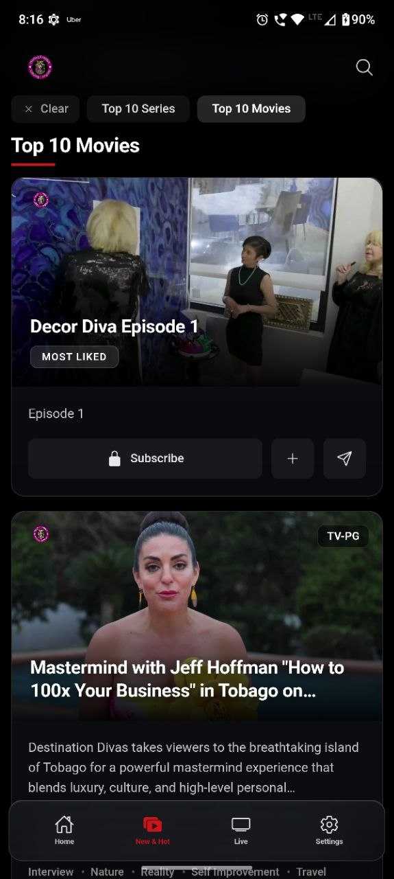
New & Hot: the programme within one card.
I gave Decor Diva Episode 1 a large image with its title and Most Liked label overlaid. The episode text and Subscribe row complete the card underneath. Keeping the access action inside the card ties it to that programme; add and share sit beside it as smaller controls. Top 10 Movies is selected above the collection, while the next Mastermind card begins below, continuing the same structure.
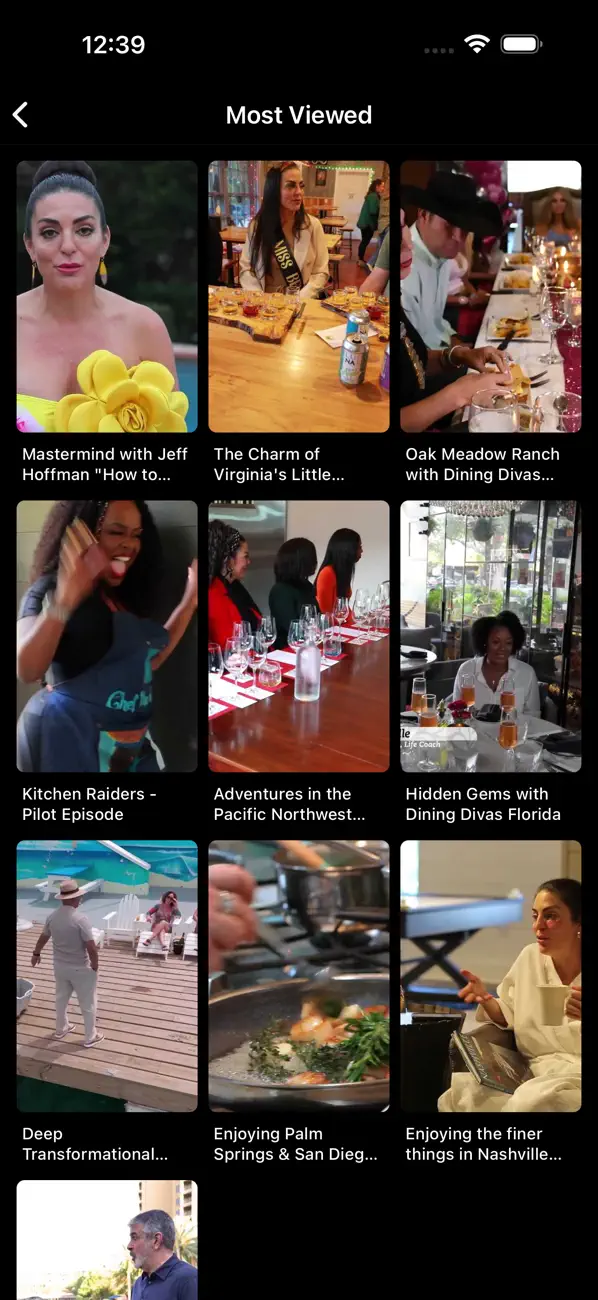
Most Viewed: more titles in the same space.
I reduced each item to a portrait and short title, leaving out the descriptions and action rows used in New & Hot. This fits three programmes across the screen. The Mastermind title is shortened here; its full name appears on the detail page below. That gives the collection room for comparison and reserves the longer information for the selected programme.
06 / PROGRAMME DETAILS
Expand the selected title without moving Play out of view.
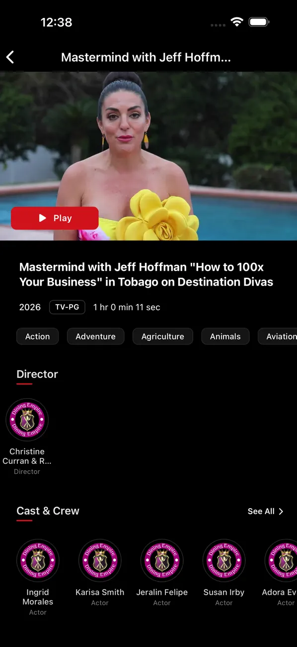
The programme, its runtime and its credits.
I placed Play on the artwork, then gave the full programme name a multi-line heading beneath it. The year, rating and runtime follow before categories and credits. This expands the shortened catalogue title without pushing the viewing action below the supporting information. Director and Cast & Crew use smaller image-and-name items further down, keeping the main programme distinct from its contributors.
07 / LIVE TV
Explain what is on air, then what follows.
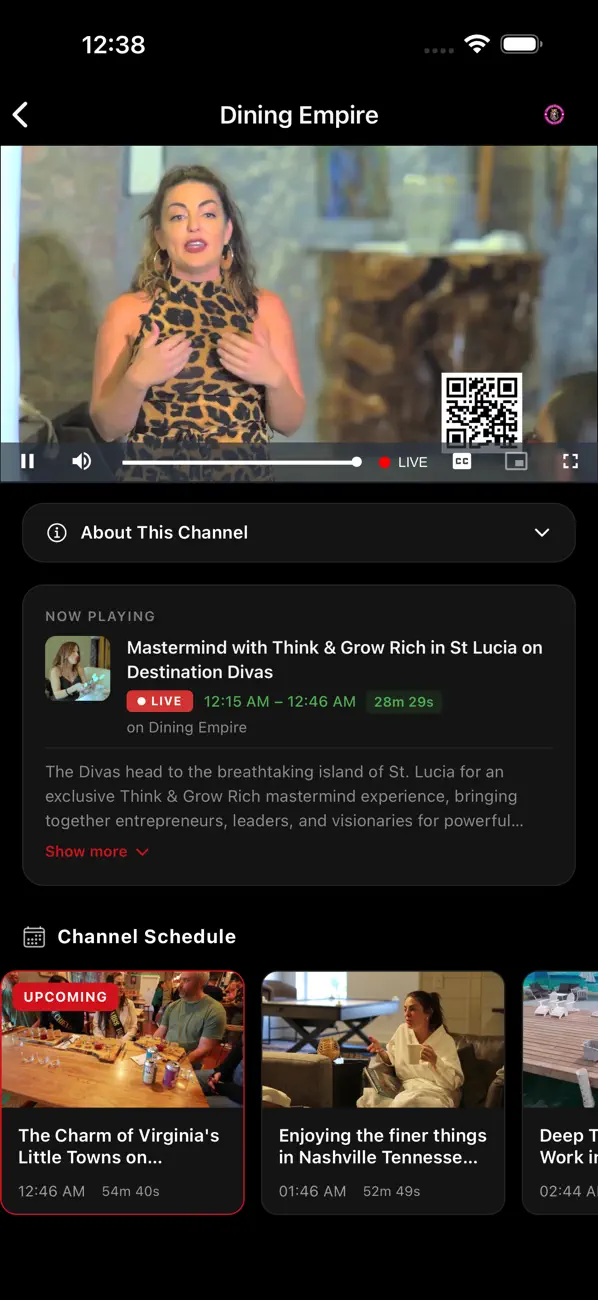
The broadcast and its schedule.
I placed the live player first, with Now Playing directly below the channel information. The current programme’s title, broadcast times and duration stay together before its description. This gives the video a specific place in the schedule. The upcoming cards continue that sequence below: the first has a red outline and Upcoming badge, identifying the immediate next programme. Playback controls stay inside the video; programme information stays outside it.
08 / MY LIST
Give saved titles more room than the discovery grid.
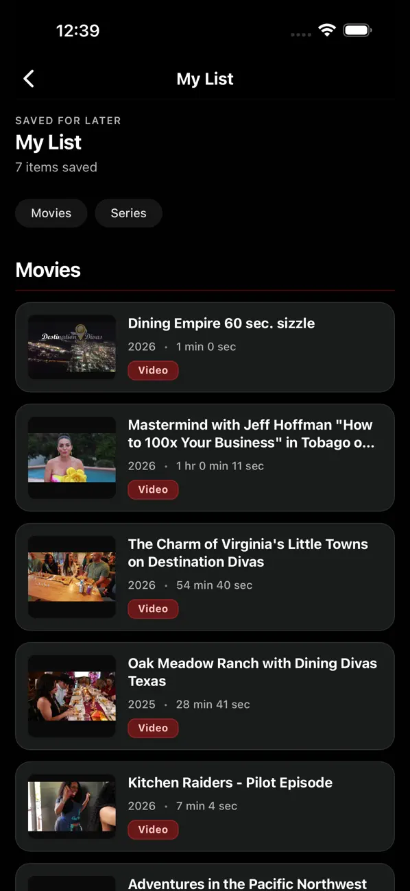
A row for each saved programme.
I changed the saved collection to horizontal rows, pairing a small thumbnail with a longer title and runtime. The image still identifies the programme, but text gets most of the width. Movies and Series sit above the rows, with the item count beneath My List. This puts the collection’s format and size before the individual entries.
09 / WEBSITE
The same programme information on a wider screen.
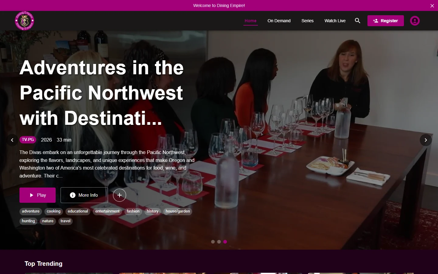
I also designed and developed the website. The views below move from the featured programme and its expanded detail panel to the browsing rows on the home page and a full series page, with magenta used for the primary viewing action throughout.
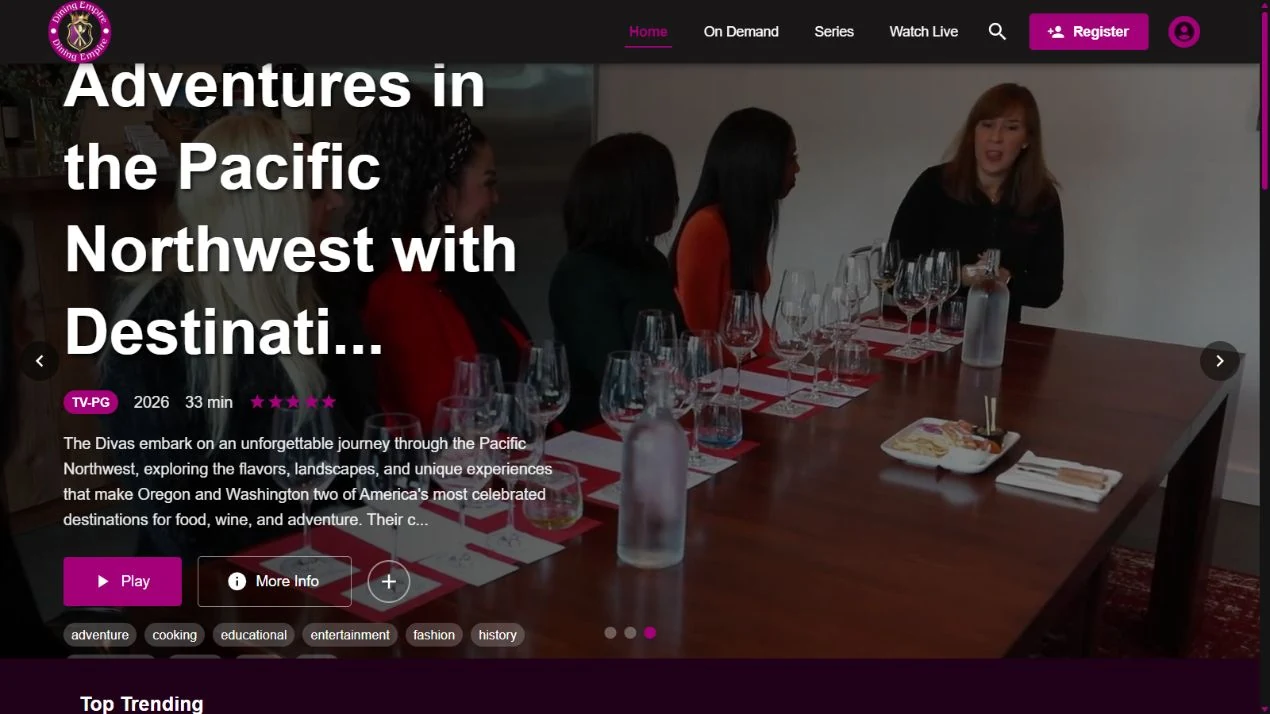
I overlaid the programme title and description on a darkened feature image, leaving the footage visible across the wider screen. Play is filled magenta; More Info is outlined and save is circular. These treatments separate playback, programme details and saving within the same feature.
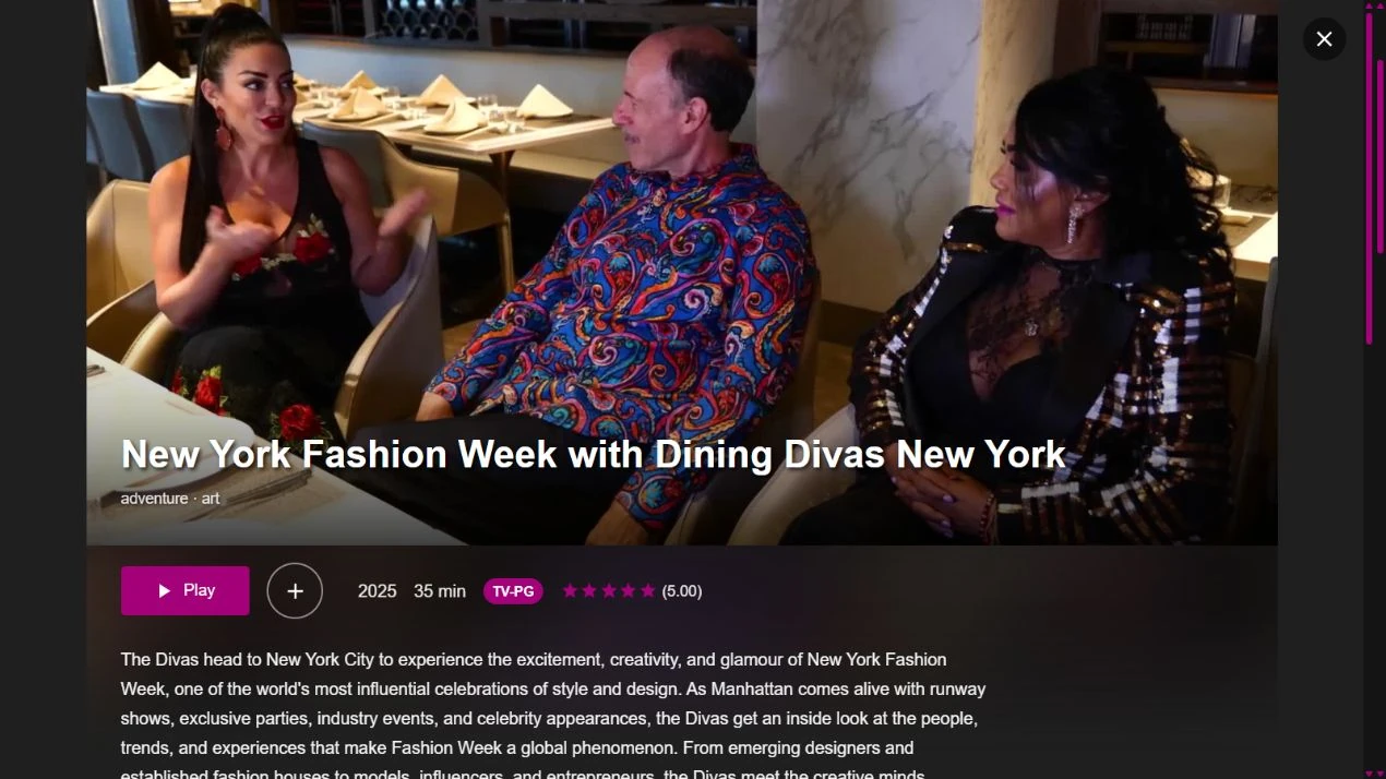
The expanded programme panel gives the image and full title their own area, then groups Play, save, year, runtime and rating beneath it. I moved the longer description below that action row. This preserves the viewing action while giving the selected programme more room than the catalogue feature.
Dining Empire website views · October 2026.
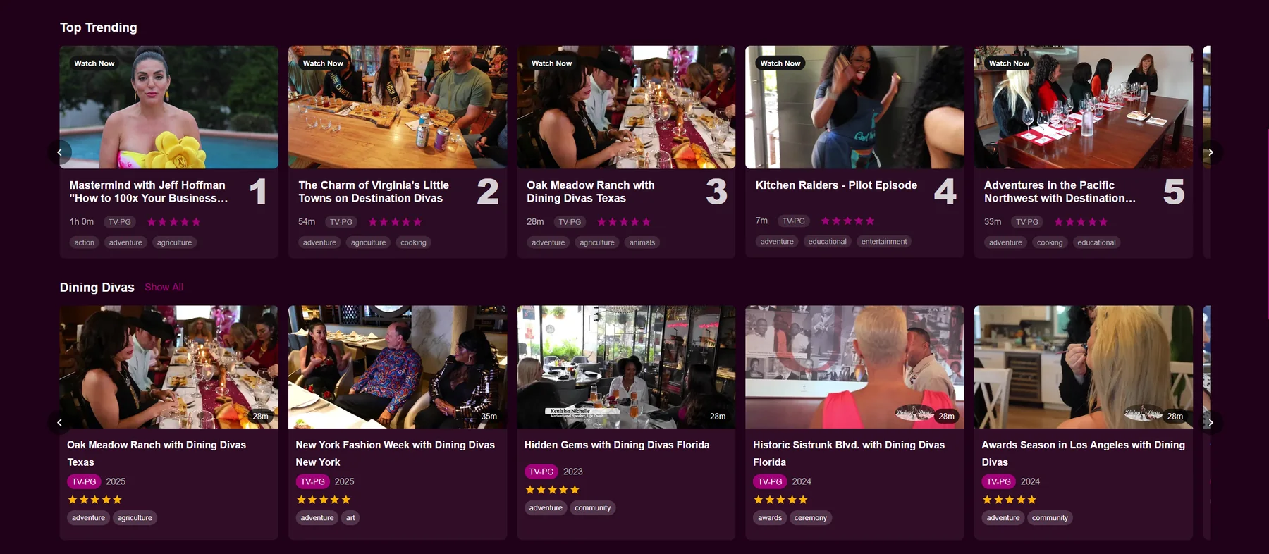
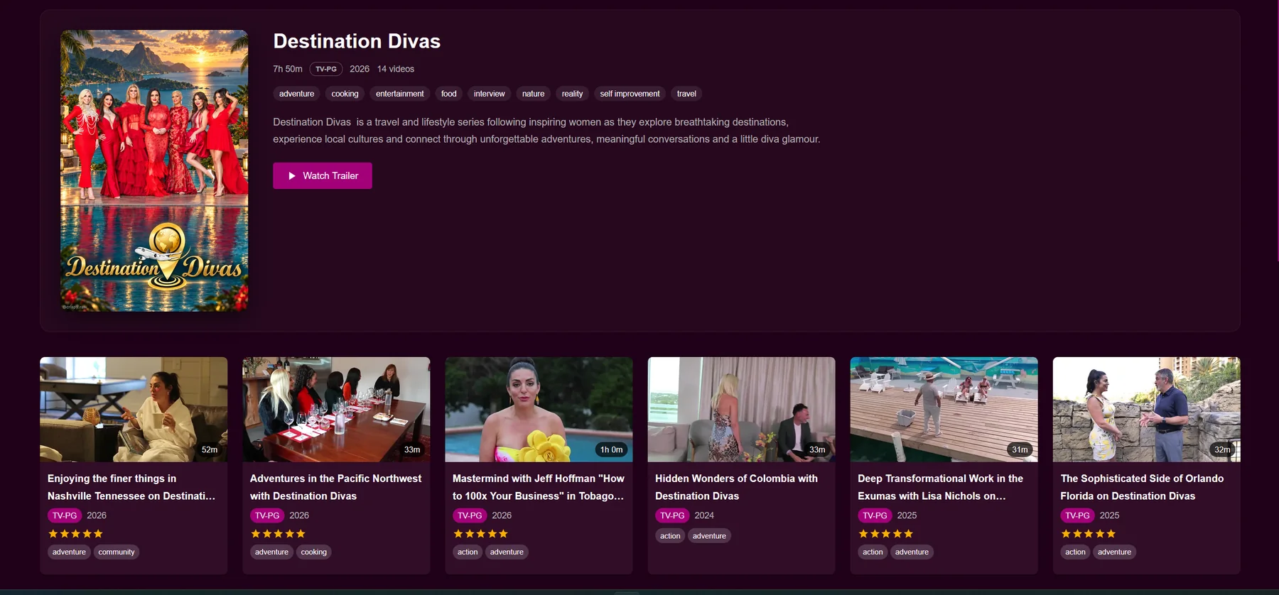
Dining Empire website views · October 2026.
EXPLORE FURTHER